Colouring 101
Practise makes perfect. At least that's what I've discovered out there. When I first started colouring, it seemed such a difficult task but yesterday, when I was doing the Sarazen Relic, I was almost doing it in my sleep. Practise! Practise! Do a whole lot more colouring... and you'll get good at it.
There are a large number of tutorials out there... but here is a step by step process of my own to encourage people who want to colour images with a computer to try and colour. Obviously, the first thing you'd need is a computer (duh!). Install your graphics program of choice, I use Adobe Photoshop (abbreviated as APS in this blog), but you can also download and use Paint Shop Pro for 30 days or something like that (or so I've been told).
Of course, you need to find a good monitor and a mouse. A good mousepad helps too. Some people prefer styluses and drawing boards, but I think that's way too much an investment if you are starting out. These tools do help, but just like the fact that the best Nike shoes can't help a lame man run any better, fancy computer drawing software and hardware can't help anyone draw/colour better as well if they can't draw/colour.
Let's start with the tutorial. The first thing to do would be to draw the image. This is known as pencilling. You may do so with a pencil on white paper (please use white paper to make life easier!) and then scan it into the computer. Or you may use the pencil tool in your computer graphics program of choice. Sometimes I do the latter. Most of the times I get someone to sketch/pencil me something. For the purpose of this tutorial, here's the image that JoetheMexican did for me.
Step 1 Draw image with pencil
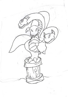 Let's check whether it's suitable. Pencils. Check. White Paper. Check. Scanned into computer. Check. All's good to proceed to the next step.
Step 2 Delete defects
If you look closely at that image, you'd notice some areas were Joe has used an eraser to remove some lines while drawing. Unfortunately, these show up on the image still and they need to be cleaned up before you can proceed. So use the magic wand tool, select non-contiguous (or uncheck it in APS), make sure that the tolerance is set to a rather high number (I used 66 in this case) and then click on the white area. This should select all the white areas and the undesired "off white areas". Make sure your background colour (in the colour palette is white) and then you can hit the delete key on the keyboard to delete all the unwanted stuff on the image.
Unselect everything to see how much of the pencils got deleted. If too much of the pencils (the good stuff) got deleted, decrease the tolerance. If the defects aren't deleted, you might either have to increase the tolerance or to delete it manually.
I don't have a picture of the image at this stage, but basically it looks like the one above without all the almost-white grey bits.
Step 3 Layer the Pencils
After you've gotten rid of all the unwanted parts, select the white area again with the magic toolbrush and then inverse the selection so that the pencils are selected. Layer via cut to create a new transparent layer with the pencils.
This will still look like the original image above except that now you have the background white layer and the pencils layer on top of it. Feel free to rename the pencils layer to "Pencils" or something similar so that it is easy to navigate.
Step 4 Give it a constrasting background
This is an easy step. Figure out what colours your image is going to be and then pick a colour that is opposite to those colours. The Sarazen is mainly going to be blue and green, so I chose red as the background. Select the background layer, and fill it with the contrasting colour. This would make colouring a lot more easier. If there are too many colours and it's difficult to pick a contrasting colour, use 100% Magenta instead (#FF00FF).
Now there are two layers, a layer that's completely of the chosen colour and the pencils layer.
Step 5 Fill in the block colours
This is the easy step. For each colour, create a layer underneath the pencils layer but above the background. Then using the paintbrush, colour the area where you want that colour. Forget about what you were taught in Kindergarten about colouring within the lines. At this stage it doesn't matter.
Some people do that for each shape in the drawing at this stage, but I find that to be hard work. Anyways, for the Sarazen image there are 5 additional layers - the stand's rock brown, the sarazen's underbelly brown, the sarazen's body green and the sarazen's body highlights and white for the claws, tooth and eyes. Notice in the image below how ugly it looks at this stage.
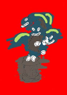
Step 6 Delete outside the lines
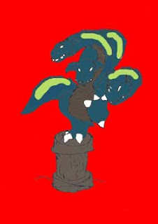
This is another easy step. Select the Magic Wand again, and select contiguous this time. Select the pencils layer and click on the part of the image outside of the object that is being coloured (the red area in my sarazen picture, but not on the background layer, on the pencils layer which is transparent). If Steps 2 and 3 were done correctly it would only select the outer area. If not, not to worry. Unselect everything and using the pencil tool, fill in the gaps on the pencil layer so that the outline of the image is clearly defined.
Once you have selected only the outside area, go through each of the colour layers and delete away the extraneous parts of it. For my image, I had to do it 5 times. Then select each of the internal areas, invert the selection and delete that - for example, for the white layers, I used the magic brush to select the claws, tooth and eyes (using the lasso where necessary), inverted the selection and deleted away all the unwanted part.
When that is done, all the colours should be in the correct areas as shown below.
Step 7 Shade to make the object look 3D
This is the hardest part. "Real" artists would use different shades of paint to paint in the drawing which is a lot of work. False artists like me use all the tools that my graphics program gives me. Burn and Dodge are two very useful tools to do shading. Blur (including Gaussian Blur) is great to cover up mistakes. There's also Smudge and the Eraser tool if that's needed. Remember Undo sometimes helps a lot more than trying to fix what is done.

Basically, pick a layer, duplicate it if you're afraid of mistakes and then work with it. I started with the body highlights above (mainly blur) and then moved on to the barrel and the eyes (below). Note, you don't usually have to do anything to a white layer (like those for the tooth and claws).

It was also while I was doing the barrel that I decided the pencils were too grey. Now I should have darkened them immediately after I did the block colours in Step 5, but I forgot, so I did them here. The best thing to do to darken the pencils would be to adjust the brightness by making it darker. It really does make the lines stand out (compare the 2 pictures above to see what I mean).
The underbelly was next (shown below), using burn and dodge to define the curvature and to provide highlights and shadows.

And then the body. For the body though, I selected the blank area for the head on the pencils layer, then the green body layer, and then layered it via Cut. I did it for each of the heads to give me 4 different body layers. Some people do this earlier with the block colours, but I find it easier to do it at this stage. Each layer then got shaded separately (mainly burn and dodge) to give the image below.

Step 8 Background, Foreground and Shadow
Once that is completed, the rest of the picture can get filled in. Pick a good custom background, to paste into the image, or if that cannot be found, create a new one. Since this is going to be a relic, it doesn't need such a great background, so I just used Photoshop to render some clouds in the background in the green of the Sarazen's body colour.
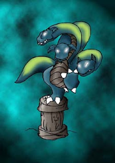
The whole thing looks weird floating in the air though so some sort of foreground is needed. For a flying/floating object/creature, a foreground can be omitted. Photoshop gives me good texturing ability and a quick skew gives it the required perspective. Note that the foreground probably won't even show up on the relic card as it might get cropped by the card border, so I'm not too worried about it being too icky.
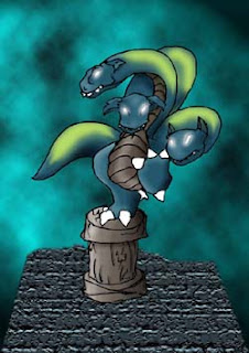
If it still does look a bit weird, a shadow can be added to make it more 3D. I didn't think it was required here so I left it at that. And that's the finished product.
Post-production work
However if you're making images for cards, a further step is required - the image needs to be sized such that it fits within the card borders. For MND, that's 300 pixels by 250 for a magi or creature or 300 pixels square for a relic and a spell (or multiples of thereof). The original of this image is 800 pixels by about 535, which is out of shape for my requirements. I need it square (and bigger than 300 pixels), so I opted to make it 800 square. I had to resize the background slightly, but that's easy to do. Here's the image that has been posted to the forums and to deviantart.
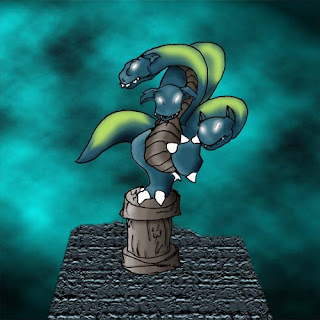
This is the size format that images for all MND custom art is required. I hope that people making their own cards will take note that I expect images to be of the correct size (and obviously of a good enough quality) if they expect me to template their cards and/or adapt their custom cards onto gEngine.
That's all it is to colouring. 8 easy steps. Remember, practice makes perfect!

2 Comments:
Hello.
I am James, writer, poet, and editor.
I'm blogsurfing, in search for talented, creative people.
We're accepting entries to our free poetry contest, as well as accepting submissions to our Creative Magazine, Flowers & Vortexes: www.promiseoflight.org
I would love to give you your own page there, at our site. This last picture here will be a nice start.
If you're interested in becoming a contributor to promiseoflight.org, email me:
editor@promiseoflight.org
And we'll talk.
lol @ spam.
this was a great post Nov. Lots to read, but very informative.
Post a Comment
<< Home