Thursday, May 31, 2007

Delayed Reporting


These next two games actually took place April 30th. I managed to get in the games, take screen shots, and write these entries on them. Yet for whatever reasons, I would not post them online until now.

When Crymzon mentioned that we were testing a new deck, I thought I would choose one of my decks that can vary wildly in its strength. Going with my Storm of Fishes deck, I would face off against Warrada first. It was a good choice. What surprised me was the application of Warrada. It just came off as weak. Aula Mindseeker would take out Warrada without even giving up a creature to Corrupt. Mostly because Aula had enough creatures in play to swing the defeat using an Undertow to setup the condition right for it. Apparently Crymzon lost connection to gatlingEngine while Aula took the battle forward into Togoth, who's purpose seemed to be to play the Naroom Shadow Geyser to grant extra energy for those Core creatures.

While Crymzon was still logged out, I found Levriat in the chat room looking for a game. About the time I was going to start a game with them, Crymzon logged back in and suggested we play a three-way battle. I guess Crymzon is used to playing three-ways were each person is designated a specific person to attack and a specific person to defend themselves from. We just did a free-for-all. Why? Simple, when I tossed down with Bograth, I knew I was going to draw attention if I pulled off my Grahnna-Oyder combination. Which I did. Baa went down easily enough after drawing at least the Pyder. While I would have loved the Swamp Hyren too at this point. It was a good start. Crymzon played the same Core deck, but they chose to start with Lanyx. Against Bograth, not a good choice. A simple use of the Poison Baloo Roots I had made sure the Core Grag couldn't fire off its power quite so easily. On the other hand, Levriat was playing Arderial. Aula started off some powerful card draw with Cloud Sceptre and her power, after playing a few cards of course. With Trade Winds in there, we saw the opening hints of a powerful Xyx combo around the corner.


After suffering from the combined efforts of Crymzon and Levriat, Grahnna would slip away and it would be up to Brog to make my final stand in the group match. At this point, Crymzon was the strongest position on the field. Having stolen two Xyx from Levriat's forces, the Xyx Elder wasn't quite the threat for Crymzon. I would focus my efforts into Crymzon to restore some balance. In the end, the dual efforts of Levriat and myself would do far more than just balance the scales back out. Crymzon would be the first player defeated despite their having had two magi left when Levriat and I were both down to our final magi already. Togoth had been the second magi again. The screen shot above is from shortly before Crymzon was defeated.


After Crymzon was defeated, my only hope was drawing more creatures. While I did draw a couple creatures, it was too little and too late. Brog just couldn't hold out long enough for any sort of comeback.
Tuesday, May 29, 2007

What's your background?

What's the importance of a background? Very much it seems. OK, I'm not art guru, I just want to note down a few observations (aka points).

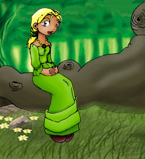
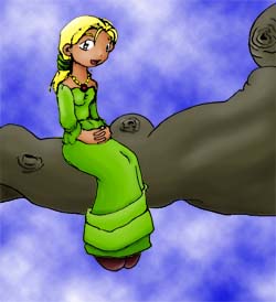
A while ago, I posted a picture of Jaylisa in the sky with... not diamonds and although it wowed Joe, it didn't really do much for me. One of the main reasons was the clash between Jaylisa's green dress and the blue sky. Somehow it just didn't match for me. I finally redid the image with a background of trees and a foreground of grass and elicited this response from Joe:

"Wow Nov, this is amazing. You make me leap for joy. (I am leaping for joy). now I want to cry.
(I am crying now.) Tear,... cry,... sob. which cards is the background from."

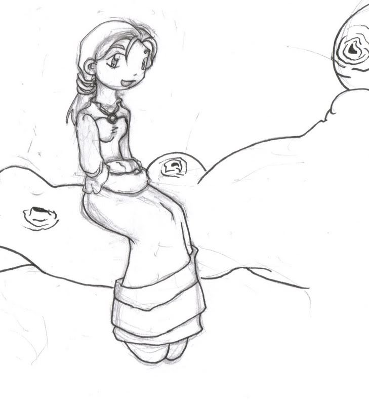
That's a tad dramatic me thinks. Here are the images - pencils by Joe, colours with blue sky by me, final colours with trees and grass.


A quick glance will show that the eye is more drawn to the final image (with the trees and grass) because it's more pleasing to the eye and probably is soothing as well. So point number one: The background colour scheme is essential and in some cases is critical when trying to make a image look more attractive, eye-catching.

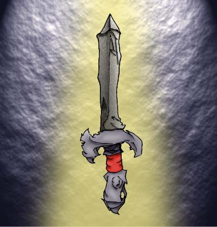
A while back as well, I did an image of a sword in a beam of light. I couldn't seem get the colouring right and at the end of the day, it just seemed very weird to me. Today as I was colouring Nazeri, I played with bands of colours for the background just for the fun of it so that I didn't have to show a blank white background and I realised why the sword didn't work for me.


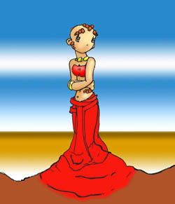
Shown above is the sword on the left (pencils by Joe, colours by me) and the mid-way point coloured Nazeri on the right (pencils by Joe, colours by me). Notice any similarities between the two? Let's take the sword - the sword is pointing up, and the beam of light is pointing down. The eye gets confused as it tries to make out where to look. The image doesn't say - look at the sword, it seems instead to say - look post the edge of the image. That is why the sword fails for me.

Likewise with the Nazeri image, the horizontal bands of blue and white seems to beg the to look beyond the left and right side of the image, while Nazeri herself seems like an arrow pointing either to the top or to the bottom. In short, the eye does not know where to look and the effect of the image is lost.

So I went back and played with beam of lights and finally finished colouring Nazeri as shown below (pencils by Joe and me, colours by me):


What's different here? Well the horizontal bands are gone, and it's been replaced with a vertical band immediately behind Nazeri. The contrast of colours, with black on the side and white behind the magi draws the eye to the figure instead of away from the page. But what about the top and bottom? Well, lighting is always from the top, so it would seem natural to the eye, but it has to be stopped from leading the eye to the bottom of the page. That's where the rock shelf comes in. It stops the beam of light and brings the eye to focus on the magi instead. And that's point number two: Use the background colours and design to point to the object of the image. Try not to use it to lead the eye away to the edge of the image.

A less subtle reason of why Jaylisa in the sky didn't work so well was the fact that the sky background was too neutral, and instead it forced the eye to use the branch as a reference point which seems to also look weird in the sky. Now the forest setting did two things to the image - the background tree trunks and the foreground grass both pointed to the trunk and of course, the trunk doesn't look out of place in a field of grass in front of trees. So point number three: Make sure your background is suitable for the subject at hand. In other words, don't draw a background that would seem out of place with the subject.

So, what's your background on your image? How did you use it to enhance your image? Is it suitable or relevant? Does the colour scheme match with the object of the image? Does it direct the eye towards the centre of the image? A good background will do all of the above, and not stand out at the end of the day.

Labels: